Logo collection
Various clients
- Identity
- Illustration
Myzium is a website which is currently in development, this is the brand identity I developed as a starting point. The logo sets the tone of the site, as an online social space for collectors. The logo fuses a letter styling akin to ‘real-life’ museums, with the slab-serif letter M. Within this letter form, the eclectic nature of Myzium’s members is demonstrated through a subtle collage of collectible items – covering a wide spectrum of interests.
The Tower Clinic logo needed to establish a healthy, positive and professional image for the business. Themes of health, support and personal development were incorporated into the brand, supported by a warm and welcoming colour scheme and typeface.
Kooji is an online store, featuring the illustrated works of Katherine Moss and myself, adorning various items from clothes and accessories to mugs and phone cases.
Similarly, the logo for Kooji was a collaborative project, and was designed to illustrate the close partnership and shared vision we have. Within the logo, the two ‘O’s create a viewport into what inspires our work. The image changes from time to time, since we are always finding new sources of inspiration.
The Book Booster offers easy access to online resources, aimed at writers who are looking to promote their new publications. Ahead of their online launch, a visual identity was needed. Aimed at published writers, the logo merges the themes of traditional writing (the physical books and the use of a slab serif typeface at the top) with the simple but powerful tools available online (the red, bold sans-serif typeface at the bottom).
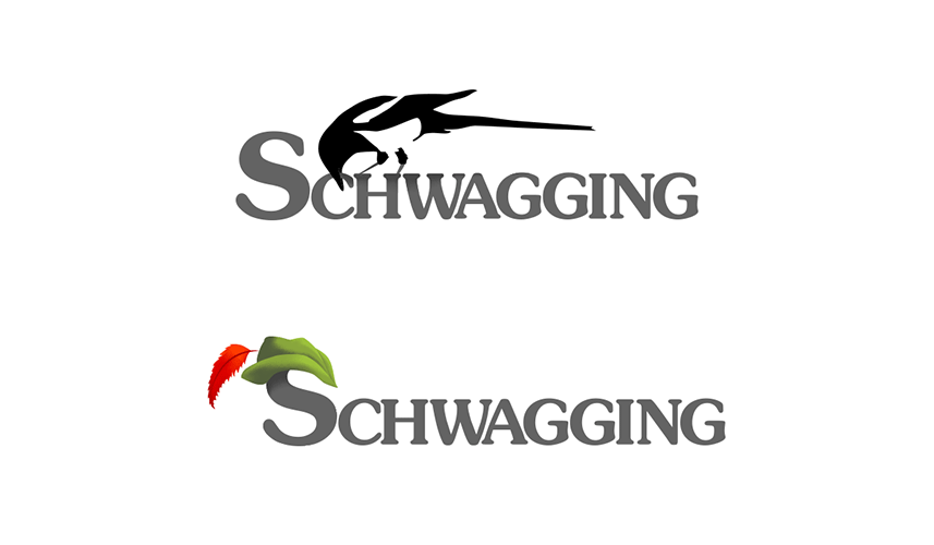
Schwagging is the art of collecting ‘schwagg’ from conferences, expos and other events. I.e. free pens, USB sticks and goody bags and the like. When confronted with the name ‘Schwagging’ for a logo design job, I instantly thought of two things. Robin Hood (for his heroic pilfering) and the magpie (for their expertise in grabbing shiny things).